UI | UX | PROTOTYPING
OLIVER BONAS CHECKOUT REDESIGN
I was tasked to redesign the checkout process on Oliver Bonas’ mobile site. The objectives of this re design were to increase conversion rates, lower cart abandonment and to increase AOV.
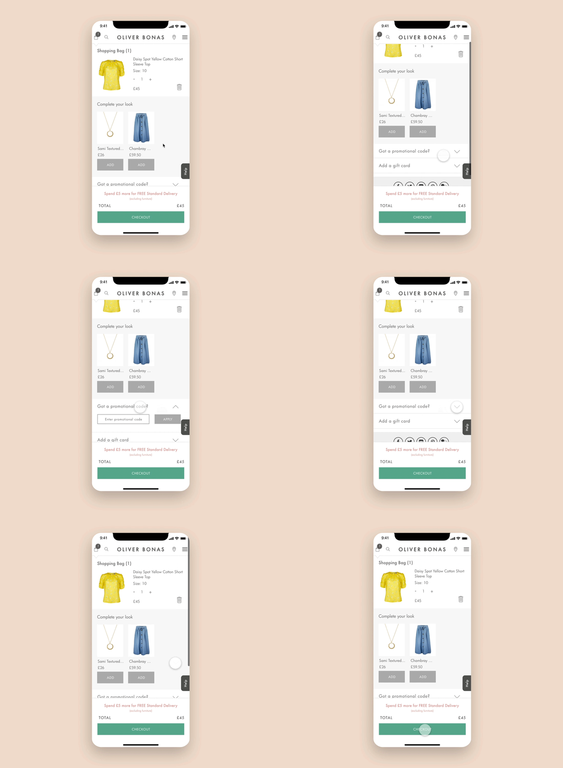
Step 1: Shopping Bag
New ‘Complete the Look’ feature. Upselling opportunity to increase AOV.
Sticky checkout CTA which follows the customer down the page with the objective being to drive conversion.
Delivery threshold message becomes more prominent by changing the colour of the text and also adding it to the sticky panel at the bottom of the screen.
Step 2: Customer details
Progress bar to inform the customer where about they are in the journey. This can also be used to navigate back to a previous step within the journey.
Real time error messages to inform the customer of field entry errors.
Step 3: Delivery options
Sticky order summary panel at the bottom of the screen allowing customers to review order and make amends. Can further push upselling features.
Ability to edit and delete saved delivery address on a customers account. New icons for these features.
Step 4: Payment
Payment process is broken down over a few screens so that the customer is guided clearly through the steps.
Icons provide visual aids and increases the customers general level of perceived security.
On the order confirmation page the newsletter sign up feature is highlighted to encourage customers to sign up.


